Most notification systems do not have an information problem. They have a presentation problem.
The email system had already done the hard work. In an earlier post, I described the scoring pipeline that separates mail needing an immediate alert from messages that can wait for the evening summary or a later review. More recently, I wrote about removing recurring junk at the source, rather than merely teaching the filter to tolerate it.
This is the final, easily neglected part: making the messages that survive that triage readable when they arrive. My daily summary already separated the important mail from the merely interesting mail, but in Telegram it was still a dense, mostly plain-text blob. The machine had made a good decision; the interface made it needlessly hard to scan.
Telegram’s newer rich-message features made this worth revisiting. The result is deliberately modest: a readable summary first, detail only when I ask for it.
The last mile of email triage
The filtering system and the formatter solve different problems. The former decides whether an email deserves interruption, a place in the daily summary, or no attention at all. The latter decides how quickly I can understand the summary once it is here.
That separation is not academic. A good score is wasted if the resulting notification makes every item look equally urgent. And a beautifully formatted list is still useless if it includes the wrong mail. First reduce the inbox to a sensible set; then make that set legible.
The useful part is hierarchy
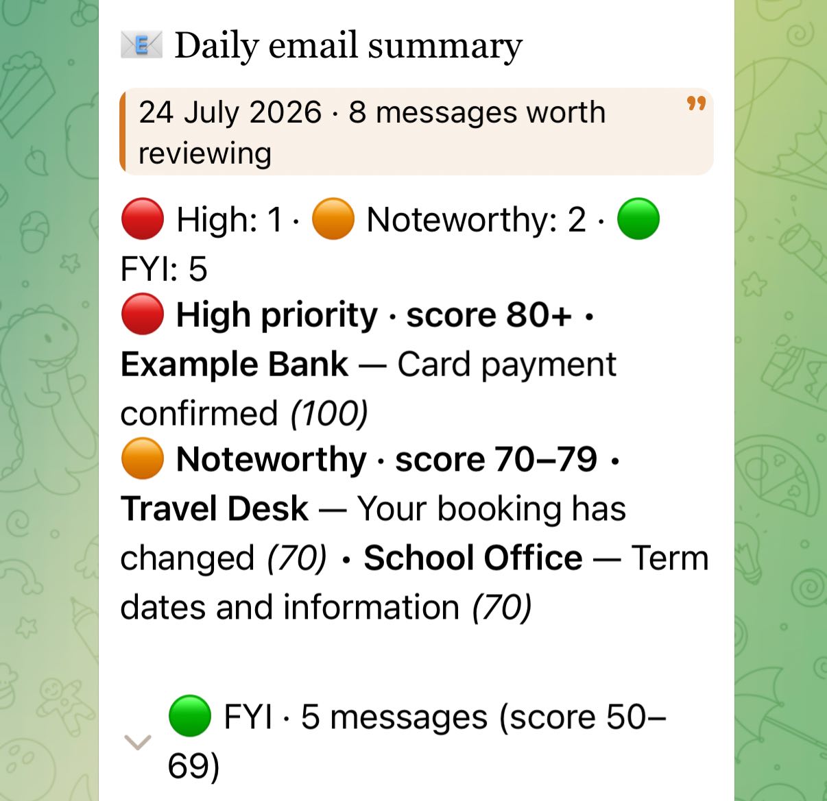
The top of the message answers the only questions that matter when a notification lands:
- How much is there?
- Is anything urgent?
- What needs attention now?
The date and message count sit in a compact quote block. A one-line status strip gives the counts for high-priority, noteworthy, and FYI mail. The red section comes first, then amber. The low-priority list is collapsed behind a disclosure control.
That ordering matters more than decoration. A notification should help you make a decision in a few seconds, not turn your chat into a tiny inbox application.
Progressive disclosure beats a wall of mail
The most useful new element is the collapsible section. It lets the daily digest include lower-priority messages without making them compete with the important ones.
I can see that five FYI emails exist, and expand them if I am in the mood. Most days I am not. That is the point: nothing is silently discarded, but nothing demands equal attention either.
This is a much better fit for a chat interface than either extreme:
- dumping every message into the chat; or
- sending only the urgent items and hiding everything else completely.
Formatting is part of the automation contract
The underlying email rules did not change. The same scoring bands from the filtering system still decide what is high priority, noteworthy, or FYI, and the once-per-day delivery guard is still there too. Only the presentation layer changed.
That distinction is important. It is tempting to call a visual improvement a “smart” automation upgrade, then quietly alter selection rules at the same time. Bad idea. When a notification changes, you want to know whether the system’s judgement changed or merely its layout.
I also added guardrails around the renderer: user-provided sender names and subjects are escaped safely, and long digests split below Telegram’s message-size limit without breaking rich markup. Beautiful formatting that fails on a long Tuesday morning is just another silent failure wearing nicer shoes.
A small pattern worth reusing
This approach now applies to the messages that benefit from scanning: high-priority email alerts, news summaries, and health reports. It is the presentation counterpart to the filtering system, not a replacement for it. Not every automated message needs a visual treatment. A one-line alert should stay a one-line alert.
But when a message contains several priorities or a list of items, the pattern is solid:
- Lead with a meaningful title and a short status summary.
- Put actionable items first.
- Use consistent visual markers for priority, not a rainbow for its own sake.
- Collapse context that is useful but not immediately actionable.
- Keep the logic and the rendering separately testable.
The goal is not to make Telegram look like a dashboard. It is to make automated messages feel less like output from a script and more like someone has already done the first pass of triage for you.
That is what a personal assistant should do: reduce the number of things competing for your attention, not merely deliver them faster.